Inventurtle
Design for an inventory app for a conceptual sandwich shop.
Overview
As part of the Google UX Design Certificate course, I designed a conceptual inventory app for a food shop: Crumbs Sandwich Shop.
My Role
I worked on the design process from inception to implementation by conducting research, user flows, wireframes, and usability testing to inform target features and user flows for the inventory app.
Timeline
Nov 2022 - Feb 2023.
Tools
Figma, Zoom, Google Jamboard.
Homepage to track, update, order ingredients
IDENTIFYING THE CAUSE OF A DISORGANIZED INVENTORY SYSTEM
Using pen and paper to manage, track, and order ingredients is difficult to read and update impacting inventory accuracies. How might we design an app that offers capabilities to easily locate, manage, and place orders for ingredients?
GAINING INSIGHTS INTO SHOP TASKS AND IDENTIFYING PAIN POINTS
I conducted interviews with shop employees about their daily tasks. Interviews were essential to gain a deeper understanding of feelings and frustrations associated with managing inventory. This dialogue helped to provide ideas on what features would be important to include in the app in order to address inventory needs to improve their current system:
1. Inventory tasks are time consuming
Majority of time is spent on tracking ingredients using a paper list and sticky notes while moving between storage rooms to retrieve ingredients causing disruption in the flow of tasks
2. Separate order list
Employees update a paper order list that is separate from the general inventory tracking increasing errors when cross referencing
3. Easy to forget
Employees have to remember where specific ingredients are located within the various storage rooms
RESEARCHING INVENTORY APPS TO DISCOVER COMMON FEATURES
Kitchen Pal: app
Pros: good use of headings and visuals, tracks expiry of items, barcode scanning option, shopping list, organized well, clickable elements, user categories, customizable
Cons: app can feel overwhelming due to lots of text & info (feels cluttered)
Pantry Check: app
Pros: barcode scanner, expiration reminders, upload real images, restock suggestions, nice visuals, food categories, search bar
Cons: clunky buttons not as clear, icons not clear to navigate
Out of Milk: app
Pros: grocery/shopping list, nice visuals, text, customization, straightforward, easy to navigate to use syncing features to share and edit
Cons: no use of images
Possible key solution insights
(1) Quick access to main inventory needs on homepage
Update inventory
Order ingredients
Storage location
(2) Provide ingredient categories with customizations
Organized sub categories
Buttons to update inventory, location notes, ability to add to order
EXPLORING DESIGN IDEAS
Highlighting features that aligned with shop needs
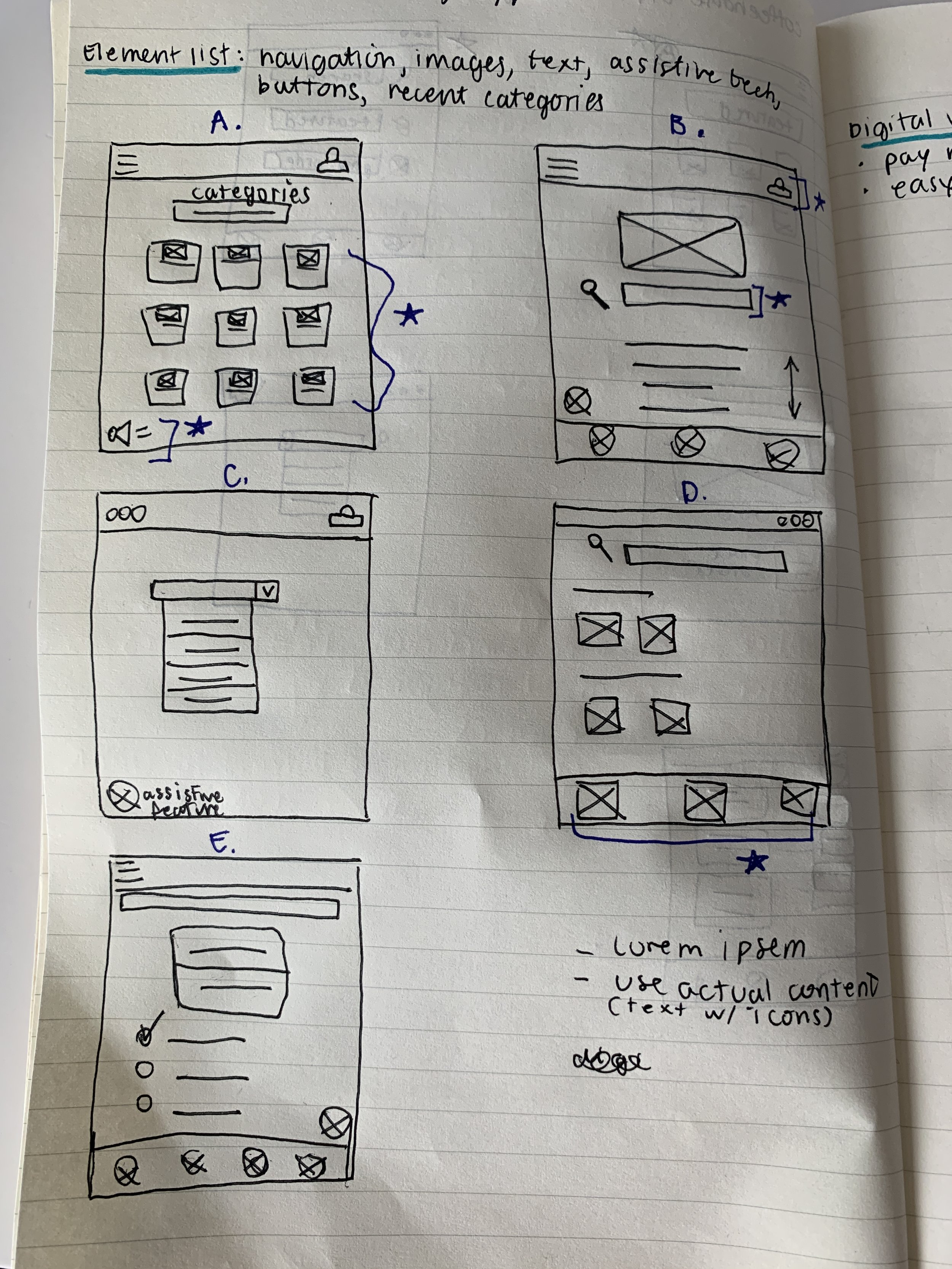
Sketching ideas was a quick way to discover various home page layouts for how icons and text could be paired together to help support visual cues for the user. Having buttons for inventory, order cart, and storage locations on the home screen could allow for a quick access to main app functions that would give employees a way to complete a task accordingly. A brief overview of user flow allowed me to see how different features could be useful for the shop, highlighting the main process of updating inventory and ability to add items to an order list within the same page. Next, prototyping was important to test user flow when updating inventory and adding items to an order.
CLEARER DESIGN IMPROVEMENTS FROM USABILITY TESTS
3 trials of usability testing revealed limitations when updating inventory and adding items to order
Usability tests involved observing click path, recording verbal thought processes and conducting a small survey to address task difficulty. This information helped to gain essential feedback to understanding which tasks user’s struggled with in order to improve design iterations.
1. Improving usability and user cues when updating inventory
Too many buttons and UI elements (e.g., spacing, colour, +/- different size buttons) were demanding attention, which made it confusing to update inventory resulting in varying click path actions.
Reduced main action buttons from 4 to 2. Incorporated a different user flow, which only then prompts the user on the next action to edit by number or buttons (-/+).
Also added a low inventory note to inform users when to add an ingredient to order easily from that same screen.
These additions helped direct the user with a more step by step process with improved prompts to update and order ingredients.
2. Adding items to order was not fulfilling user needs with limited features
Before
After
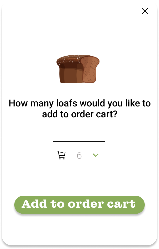
Adding inventory to an order was also confusing in only having 1 screen to complete this process with limited functions (using arrows icon to go up or down (having more options showing a -/+ bar more familiar and added text box gives user more freedom with inputting bigger numbers than labours task of continually pressing the + size) it was observed user hesitated with recognizing what with blank box and arrows meant) do seeing an , missing current quantity (having this would remind the user how much is currently available to without having to flip back and forth between screens to check).
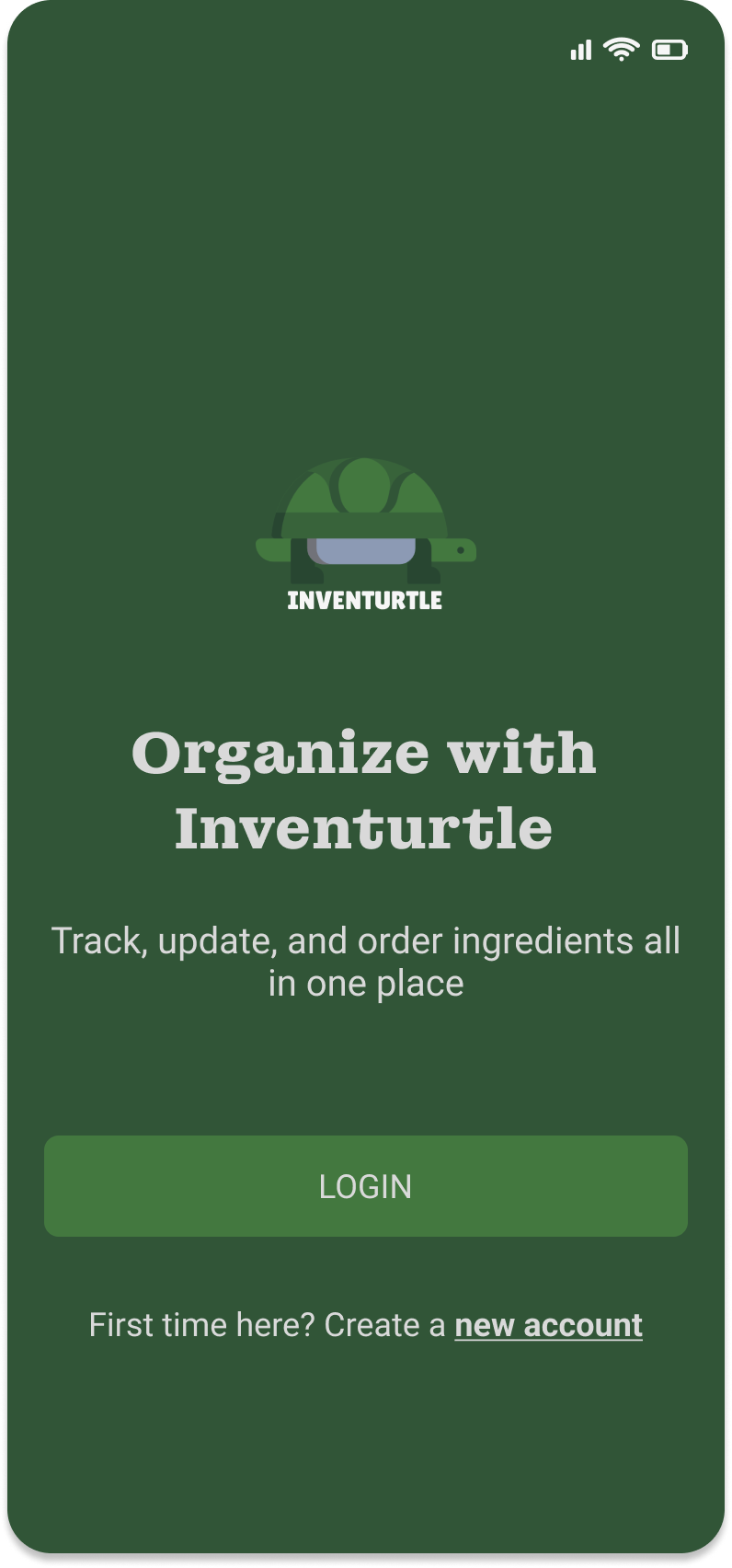
Login/Sign Up
Inventory, Storage, and Order
Subcategories
PROJECT CONCLUSION
Inventory app offered a solution for an improved organization system for ingredients, increased productivity, and a time saver
The app allows for a collaborative system. Integrating this app within the shop has significantly increased productivity within the shop and has ultimately improved on time-efficiencies while managing inventory.
Throughout designing, I learned that each feature and layout within the app could continually be improved. The usability studies were key in helping to inform app improvement by highlighting problem areas with navigation and issues completing certain user tasks.


